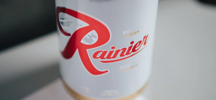
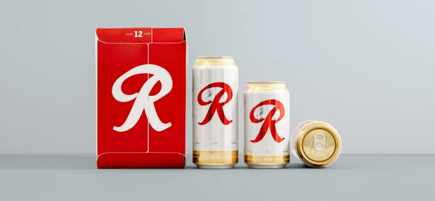
Pabst Brewing Company
Pabst has gone from a midwestern working man’s beer to a buck-a-can artistic hipster brew to the corporate business daddy of some of our favorite regional labels. They have done an incredible job of reinventing themselves over and over again, proving that you don’t win the blue ribbon by sitting on the porch.
Show them some love at pabst.com
- Alignment
- Positioning
- Identity
- Concepting
- Campaigns
- Graphic Design
- Voice & Tone
- Messaging
- Naming
- Packaging
- Visual Language
- Standards