The making of Rainier Jubilee 2025: behind the work
Relevant case studies
Outline
00:00
Introduction to Jubilee project for Rainier Beer
Chris from Parliament shares his excitement about a recent project for Rainier Beer. Each year, Rainier releases a special edition called Jubilee, featuring the same beer with unique packaging. This is their fifth or sixth time designing Jubilee, and Parliament feels this year’s design is particularly nostalgic and outstanding.
00:27
Nostalgic inspiration from classic Rainier ads
The video discusses Rainier’s iconic advertising in the Pacific Northwest, highlighting the memorable Wild Rainiers campaign and a particular classic spot. This nostalgic inspiration influenced the design of this year’s Jubilee packaging, generating excitement among the Rainier team and the local community.
01:04
Showcasing the new Jubilee packaging design
Chris talks about the widespread availability of Rainier beer in stores like Plaid Pantry, Fred Meyer, and Safeway. He expresses excitement about the product’s design, mentioning details like the motorcycle, curved road, frogs, and Mount Rainier imagery on the packaging. He enthuses about the full-on Rainier beer 30-pack and invites viewers still watching to see behind-the-scenes content and ideas cut from the final version.
02:02
Design restrictions and color palette rules
Chris discusses working on the Jubilee project, highlighting both the fun aspect and the constraints involved. The design must adhere to a strict color palette of gold, silver, and red, and the branding needs to be unmistakably associated with Rainier. This ensures that whether the product is held in hand or displayed on a store end cap, it clearly represents the Rainier brand. Additionally, the concept must effectively translate across various media.
02:28
Packaging media and design concepts overview
The discussion focuses on designing packaging across various materials like cardboard, aluminum cans, skis, snowboards, and apparel, emphasizing the need for flexible concepts that fit different shapes, such as tall boys and 30-packs. Several creative concepts are introduced: “Old School Cool,” inspired by vintage etching artwork reminiscent of classic beer labels; a “Barbarian” theme featuring a god of mountain fresh beer with wild reindeer-pulled chariots; a psychedelic mountain fantasy world hidden on Mount Rainier; and “Portraits of Lore,” hinting at legendary-themed imagery.
03:19
Collaboration with illustrator Matt Stikker
The video discusses a creative series of cans featuring different characters, like a barbarian, a Yeti, and Candolf, and highlights a new twist on the concept with modern Rainier beer. The team collaborated with illustrator Matt Stikker, known for his excellent work, to develop the packaging design. Although OG Matt’s style had to be toned down for packaging, Matt remained enthusiastic and skilled. He created initial compositional sketches that were integrated into the packaging design, and the team worked closely with him to refine the relationship between the brand elements.
04:08
Final artwork details and packaging suite
Matt finalized the artwork featuring Wild Rainiers, a motorcycle rider, and a frog and Mount Rainier, and also created colorized versions for diverse uses. The art was adapted for multiple applications. Subsequently, the team developed the complete packaging suite for Rainier Gin, including various pack sizes and can types, ensuring the design looked consistent and appealing across all formats. The final step involved preparing mechanical files to meet specifications, leveraging Parliament’s experience with Rainier’s regular packaging.
04:56
Additional products and shout-outs
Chris emphasizes the importance of quality and maintaining good relationships with printers. He highlights that Rainier is not just a typical beer company, noting its unique merchandise, such as t-shirts and skis, and encourages viewers to check it out. The segment concludes with shout-outs to the team at Parliament for their excellent work, appreciation for the Rainier brand and its people, and a nod to Matt Stikker, expressing eagerness to collaborate again.
Transcript
Hey friends, it’s Chris at Parliament, and I am stoked out of my mind about some new work we did for Rainier Beer. I cannot wait to show you.
So, every year around this time, Rainier Beer puts out a special collection. They call it Jubilee. Same beer, different packaging.
This is the fifth, I don’t know, maybe the sixth time we’ve designed Jubilee for Rainier. And every year it turns out amazing. But I’m especially excited about it this time. It’s just super nostalgic.
If you grew up in the Pacific Northwest, you probably remember Rainier’s classic advertising. I mean, it was so good. You had the Wild Rainiers, of course, and you also had this spot.
[Classic Rainier Beer ad plays]
Oh man, legends in advertising.
And that’s where the inspiration for this year’s Jubilee packaging came from. So, it’s fun and super nostalgic. Everybody’s really excited about it. I mean, definitely on our team, everybody at Rainier. I hope you are as well.
If you live around here, I’m sure you’re going to start seeing it in every Plaid Pantry and Fred Meyer and Safeway and, you know, I mean, everywhere you can find Rainier.
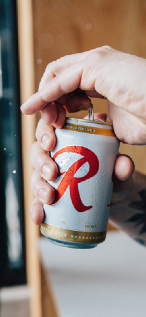
So, how’d it turn out? Well, if you haven’t already seen it, let me show you.
[Shows a six pack of Jubilee]
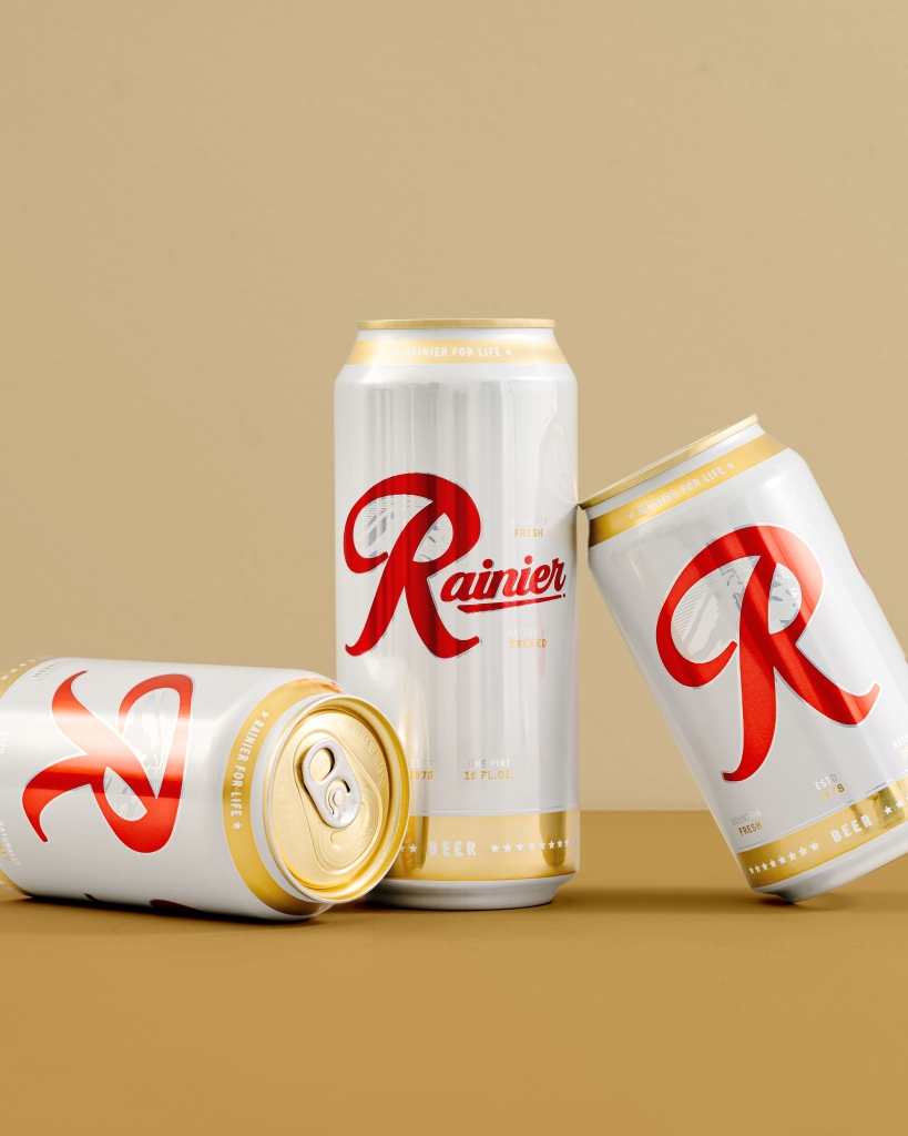
Probably hard to see on the screen, but oh, man, it’s so good. I’ll pull up some images so you can see it really well, but dude, I mean, unbelievable.
The 30-pack has a full-on Raaaaaaineeeeeer Beer. I mean, dude, this is so rad. You got the motorcycle, you’ve got the curve in the road, you’ve got these frogs croaking Rainier, you know, they’re not even hibernating. They’re staying up all winter for Jubilee. We got Mount Rainier itself, and it’s full of lager. I mean, what else do you need?
If you are any sane person, you’re not even watching this anymore. I mean, you are in your car on your way to get a 30-pack.
But if you’re still watching and you’re interested in, you know, seeing some of the ideas that hit the cutting room floor and a little behind-the-scenes stuff, I’m going to pull back the curtain and I’ll bring you along.
So, first things first, Jubilee is so fun to work on, but there are quite a few restrictions.
We need to use the same color palette. So, we’re restricted to gold, silver, and red.
And it needs to be unmistakably Rainier. That means if it’s in your hands, it looks like Rainier. If it’s all the way down on an end cap across the store, it looks like Rainier. It can’t look like another brand.
The concept also has to read well on a lot of different media. We’ve got packaging that’s cardboard. We’ve also got shiny aluminum cans, which might be printed on skis, snowboards, or apparel.
So, we have to take all of that into consideration. Finally, the concept has to be flexible enough to work across a wide range of shapes. Tall boys, 30 packs, skis, you get it.
Okay, so let me walk through some of the concepts.
The first concept we had was called old school cool. With this one, we wanted to lean into the old-style etching type of artwork. You know, maybe something that could show up on your grandpa’s beer.
The second concept leaned into the idea of the barbarian. You know, the mighty god of mountain fresh beer.
Maybe he rides a chariot that’s pulled by a bunch of Wild Rainiers. Something like that.
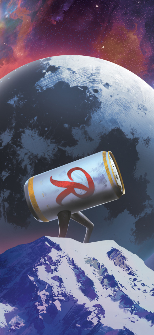
With this one, we went on a journey to the psychedelic mountain. You know, maybe this is a crazy fantasy world that is hidden from our eyes up on Mount Rainier.
The fourth concept was portraits of lore. And with this idea, we were thinking maybe you have a series where you have a bunch of cans. Each can might have a different character on it. You know, you have the barbarian, you have Yeti, Candalf. This could be a really fun one.
And of course, the modern Raineer Beer. This is where we landed a new twist on a great idea.
Once our team and Rainier’s team landed on a concept, we knew exactly who we wanted to work with. Matt Stikker. Stikker with two K’s. We’ve worked with him before. He’s so good. He’s an illustrator. I mean, I just I love his work. We all do. And we thought he’d be a really good fit for it.
Of course, we knew he’d have to pull back a little bit or maybe a lot of bit. We weren’t going to have broken femurs on the packaging, but he’s a pro. We know he could do it, and he was up for the task.
After kicking things off with Matt, he drew up some rough compositional sketches. We took those sketches, and we dropped them into the packaging artwork.
From there, we worked with Matt to perfect the relationship between the brand elements and the elements in the drawing. Matt finalized the artwork and it turned out so good.
It’s got the Wild Rainers. It’s got the little moto person on the, you know, CB500 or whatever it is. It’s got the frog and Mount Rainier.
Matt also developed some colorized versions for some different uses. And then he also broke up the art so it could be used in a variety of other places. Same deal. Some colorized versions. I mean, look at this frog. Unbelievable. So cute. If you don’t like this frog, I don’t know what’s wrong with you.
From there, we took the final art and began building out the entire packaging suite. We’ve got Rainier Gin. We’ve got the 12-packs, 24-packs, 30-packs, tall boys, and regular 12-ounce cans. We needed to make sure that it looked good across all of them, and we did that.
The final step in the packaging process was building out all the mechanical files and making sure that they were to spec. We do all of Rainier’s regular packaging as well, so we kind of know the deal with this stuff, but still, we got to make sure that it’s super tight and the printers love us.
That could be the end of the story, but it’s not because Rainier is not some run-of-the-mill beer company. We’ve got t-shirts, and Rainier did some skis. Run, don’t walk to Rainier’s site and get some skis.
Oh man, I am done. Praise the Lord. I need to crack open a cold one. But before I do, I want to give some shout outs.
All right. Mega thanks to the team at Parliament. I mean, they did the work. They’re so good. Couldn’t ask for a better crew. Rainier. Same deal. Love working with you. I mean, fantastic people. Great brand, good company, amazing beer. And of course, Matt Stikker, Rock God, legend. Can’t wait to work with you again.
All right, I’m out of here. Be brave. Stand apart.